This year has been filled with fascinating science stories, and my colleagues and I on the Scientific American graphics team have been excited to help tell many of them through charts, illustrations, maps and diagrams. We have developed information-rich visuals to cover a wide range of subjects from math to anthropology that convey themes as grim as nuclear fallout and as inspiring as becoming a hero in your own life’s journey. Here are a few of our favorites.
Mapping Nuclear Fallout
As part of the special report “The New Nuclear Age,” published in December, Princeton University researcher Sébastien Philippe, cartographer Svitlana Lavrenchuk and simulation engineer Ivan Stepanov generated a series of maps highlighting the locations of U.S. missile silos and showing the potential trajectories of fallout if those silos were targeted in a nuclear attack. These images are astonishing not just for the extent of deadly radiation they reveal but also for the wild variability in those radiation levels, depending on how the wind happens to be blowing on a particular day. The featured maps show what fallout might look like over a four-day period based on weather data from nine different days in 2021.
On supporting science journalism
If you're enjoying this article, consider supporting our award-winning journalism by subscribing. By purchasing a subscription you are helping to ensure the future of impactful stories about the discoveries and ideas shaping our world today.

Credit: Sébastien Philippe, Svitlana Lavrenchuk and Ivan Stepanov
A Planet in Peril
Speaking of ways the world could end, a study published in September found that we have already crossed six of Earth’s nine so-called planetary boundaries, constraints that are needed to maintain an environment akin to that of preindustrial times. While this is not great news, staff writer Meghan Bartels’s story covering the research highlights how scientists are directing their energy toward not just naming but also solving the problems outlined in the graphic below.
.png?w=900)
How to Be a Hero
If thoughts of nuclear annihilation or environmental doom are weighing on you, this next story might be worth a read. In a delightfully optimistic opinion piece, researchers Ben Rogers, Kurt Gray and Mike Christian describe the psychological benefits of viewing your own life as a “hero’s journey.” And this equally delightful graphic by Matteo Farinella sums up how the classic hero’s journey epitomized in epic tales such as The Lord of the Rings can be reimagined for the regular, modern human.
.png?w=900)
A New Way to Count
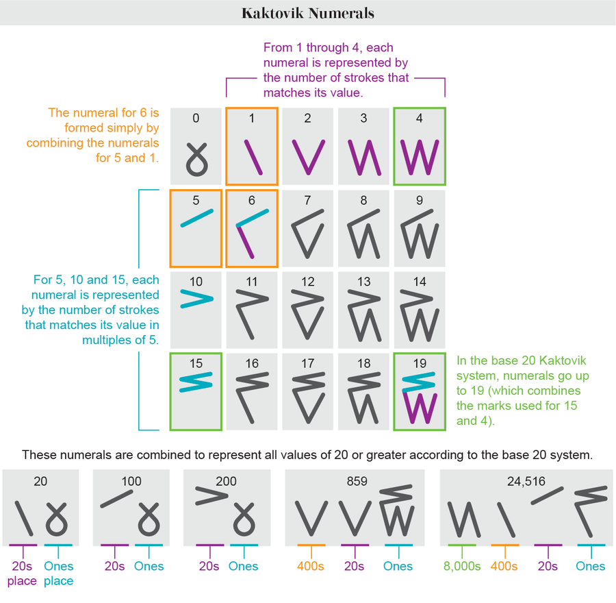
For more modern-day heroism, look no further than the Inuit middle schoolers who, in the 1990s, developed an ingeniously intuitive number system. In a fascinating story, Amory Tillinghast-Raby explains how the “Kaktovik numerals” crafted by the Indigenous students made their way from a remote Arctic classroom to Silicon Valley success: the numerals were adopted into the latest update of Unicode for widespread digital use. The graphic below breaks down how the numerals, which were built on a base 20 system, use different combinations of simple marks to reveal their value visually.

Credit: Amanda Montañez; Source: “Unicode Request for Kaktovik Numerals,” by Eduardo Marín Silva and Catherine Strand. Submitted to Unicode Technical Committee Document Registry March 16, 2021 (reference)
Visualizing the Power of Women
In one of our most compelling feature articles of 2023, scientists Cara Ocobock and Sarah Lacy flip the old theory of “man the hunter” on its head, positing that women are actually better suited than men to endurance activities and likely hunted in prehistoric times. As they lay out the evidence, gorgeous graphics such as the one below, by Violet Isabelle Frances of Bryan Christie Design, lend visual support to the case by highlighting features that confer endurance and power activity advantages.

Credit: Violet Isabelle Frances for Bryan Christie Design
24 Hours of Life in One Chart
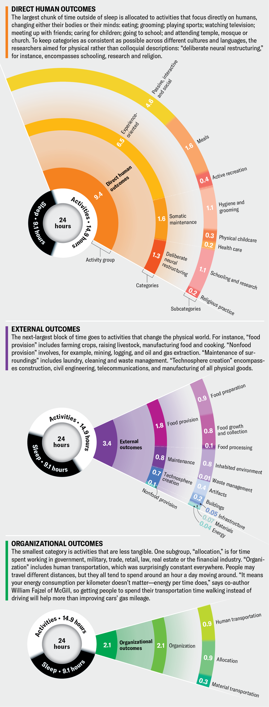
Most people probably have a general sense of how they divide up their time on a daily basis. But what does the human day look like on a global scale? Scientists dug into the data to try to answer that question, and we dug into their study to visualize the answer. The resulting graphic, by Studio Terp, uses an intuitive circular format with concentric layers of information to distill the data and their associated context into a clear, colorful and enlightening visual guide.

Credit: Studio Terp; Source: “The Global Human Day,” by William Fajzel et al., in Proceedings of the National Academy of Sciences USA, Vol. 120; June 2023 (data)
